I now feel that some complex designs should not be classed as being inefficient due to they're extra weight or applications/accessories, as sometimes they need this extra design to improve the usability of the product. It can also be said that some simple design can look too basic which can put off a user from buying the product, this is because certain buyer groups (particularly the older generation) have been programmed to think "more mean better value". The following photo's show one comparison I found proving simplicity isn't always the better way to design:

The two designs are both used for opening wine bottles, however the one on the right which would be classified as the more complex actually works better. This is because the twin arm corkscrew allows the user to control the pulling force on the cork through the mechanical force of the gears. The simpler T-bar corkscrew applies the opening force suddenly, which could possibly cause spillage of the contents.
Information from the above paragraph and image should by no means give a designer/user the impression that complex designs are always more efficient, it is there to show how I have got to my conclusion on the subject. Some designers follow the Ockhams Razor principle resulting in successful simple products that would be less efficient in there more complex form. The evolution of technology is the best example of this with companies such as Apple, Nokia, Sony, etc capitalising on the simplicity, as this type of design works better in the market. Following the first set of links below shows a set of simple products, the second set show older versions of the product to compare the design:
New
http://store.apple.com/uk/browse/home/shop_ipod/family/ipod_classic?mco=MTE2NTc
http://www.nokia.co.uk/link?cid=PLAIN_TEXT_1204523#/main/landing
http://www.sony.co.uk/lang/en/product/dsc-t-series/dsc-t900
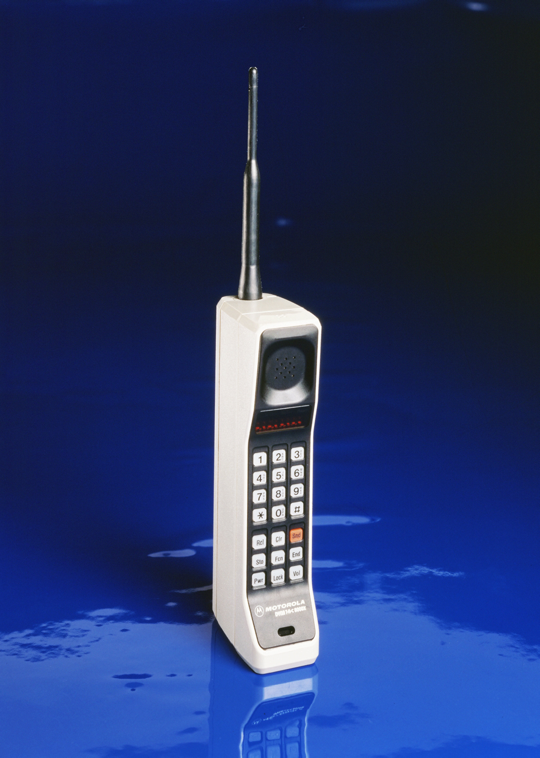
Old
http://blogs.msdn.com/frankfi/archive/2007/11/19/forget-all-your-mp3-players.aspx
http://www.maurograziani.org/wordpress/wp-content/motorola.jpg
http://commons.wikimedia.org/wiki/File:Olympus_XA_camera_and_film.jpg
Comparing the old to the new products shows that the new simpler designs are more appealing and more efficient to use. Apples IPod has the simplest design around with just a screen and circular touch sensitive navigation and this product has made the company millions and started off a new trend in customer loyalty through itunes.
In looking further into different products and they're variations my original opinion has changed from "designers should follow Ockhams razor principle", to that of "the success of a design relates to a balance between function and simplicity". I will therefore only let myself be influenced by this rule as long as simplicity does not compromise the way the product works.
Hi friends i just want to use this opportunity to thank this great loan officer Mr Ben Lee who helped me with a loan i was very in need of $7,000,000.00 USD so i was introduce to Mr Ben Lee a loan officer so i contacted his email and i got the loan amount of $7,000,000.00 USD i will advice anyone who is in need of a loan to contact email: 247officedept@gmail.com Or you can whatsapp his via +1-989-394-3740.
ReplyDelete